News
What Colors Go with Terracotta Floor Tiles: 8 Pairings

Why does the same cream paint look calm beside one terracotta floor and harsh beside another? The answer to what colors go with terracotta floor tiles starts with the tile's undertone: warm white and cream, sage, navy, olive, natural oak, charcoal, teal, and dusty rose all work when their temperature and saturation suit the clay in the room.
Terracotta isn't one fixed color. A pale tile may lean peach or pink, while a deeper tile can read burnt orange, brick red, or brown. That shift changes which companion color looks balanced, so paint names and trend lists aren't enough on their own.
Each pairing below is organized by undertone and contrast level. It also gives placement guidance for walls, cabinets, furniture, or textiles, plus a sampling step for checking the combination beside real tile in the room's daylight and evening light. That approach prevents a common mistake, choosing a color from a small screen image and discovering after installation that the floor looks far more orange than expected.
Table of Contents
- 1. Warm White and Cream Walls
- 2. Sage Green Walls
- 3. Deep Navy Accents
- 4. Olive and Moss Green
- 5. Honey and Natural Oak Wood
- 6. Charcoal and Black Metal Accents
- 7. Teal and Turquoise Accents
- 8. Dusty Rose and Blush
- How each terracotta pairing compares by contrast, placement, and mood
- Plan the Palette Before You Order the Tile
1. Warm White and Cream Walls
Warm white and cream give terracotta the clearest, least risky wall treatment. They keep attention on the floor, brighten rooms with limited daylight, and share enough yellow or beige warmth to connect with orange-brown clay. A blue-leaning white does the opposite. It can make the tile look sharper, more orange, and visually separate from the walls.
The comparison below shows why undertone matters more than lightness alone.
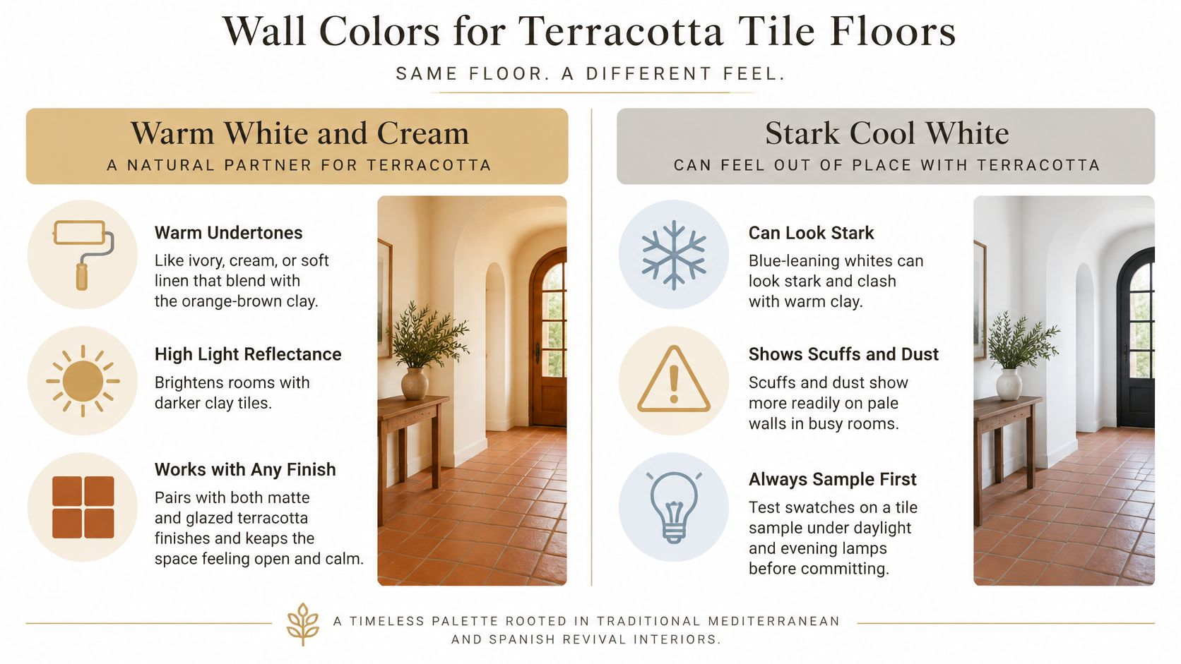
A Mediterranean-style kitchen with cream plaster walls over unglazed terracotta works because neither surface fights for attention. A sunroom can use ivory walls and a light wood beam for the same effect, although very pale walls in a bright south-facing room may wash out beside a pale peach tile. Deeper cream or warm beige gives that floor more definition.
Neutral foundations also leave room for one stronger accent. In a 2023 survey reported in the West Fraser 2023 color trends summary, 58% of interior-design experts favored neutral palettes with bold accent colors. With terracotta already supplying the bold warmth, the wall usually shouldn't compete.
How to Test Warm White
- Paint large samples: Brush each candidate onto board and stand it against several tiles, then check it in daylight and under evening lamps.
- Reject blue-leaning whites: Choose a white with a visible warm undertone when the tile leans red or orange.
- Measure before ordering: Use the box calculator to estimate boxes, then check the product page for exact coverage per box.
The short video below is useful for comparing how surrounding finishes change the tile's apparent depth before paint is finalized.
For an irregular layout, homeowners can request a free estimate through the estimate form rather than guessing quantities.
2. Sage Green Walls
A dining room with sage walls, terracotta underfoot, and a natural wood table shows sage at its best. The gray-green cools the clay without creating the hard contrast of navy. It also connects the floor to plants, garden views, and natural textiles, which suits dining rooms and kitchens that need color but shouldn't feel busy.
The room sketch below gives a useful sense of that softer balance.
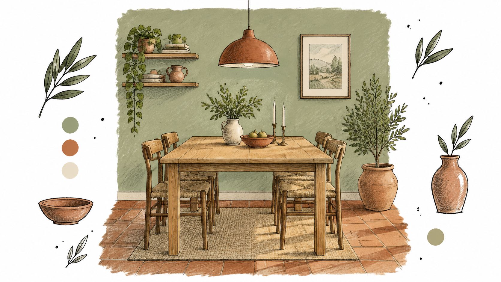
Sage works through shared natural character rather than strong opposition. The pairing is described in guidance on colors to pair with terracotta floor tiles as an environmentally harmonious combination, with sage and olive balancing terracotta without overwhelming it. That's the key trade-off. Sage calms the room, but a sage that's too gray or blue can look cold beside a strongly red floor.
Interest in the color has measurable support. In 2024, 26% of 1stDibs' design-community respondents named light green or sage their favorite color, according to the 1stDibs interior design trends report. Popularity alone doesn't settle the shade, though. The sample still has to suit the tile batch.
Placement and Sampling
Sage can cover all four walls in a dining room with decent daylight. In a kitchen, it's often stronger on lower cabinets or an island, with warm white walls preventing the combination from becoming dark. Designers and homeowners should test samples in morning, afternoon, and evening light because sage shifts noticeably as daylight cools.
Sampling rule: Pick a sage with a slight warm undertone for orange-red tile, and reserve cooler gray-sage for paler, browner clay.
Tile quantities can be estimated with the box calculator before paint and cabinetry are ordered around the floor. To turn a room size into tiles and boxes, use the tile calculator, which shows typical coverage by tile size.
3. Deep Navy Accents
Deep navy gives terracotta its strongest classic contrast. Blue sits opposite orange on the traditional color wheel, a relationship explained in Oil Painters of America's discussion of complementary color. Because terracotta belongs to the warm red-orange family, navy makes its orange and red notes appear richer while the floor keeps the blue from feeling cold.
That contrast needs control. Navy on every wall can darken a small kitchen and push a saturated floor toward visual overload. It works better as the controlled second color, with terracotta remaining dominant underfoot and warm white providing breathing room between them.
The kitchen illustration below shows navy used as cabinetry rather than as a room-wide wall color.
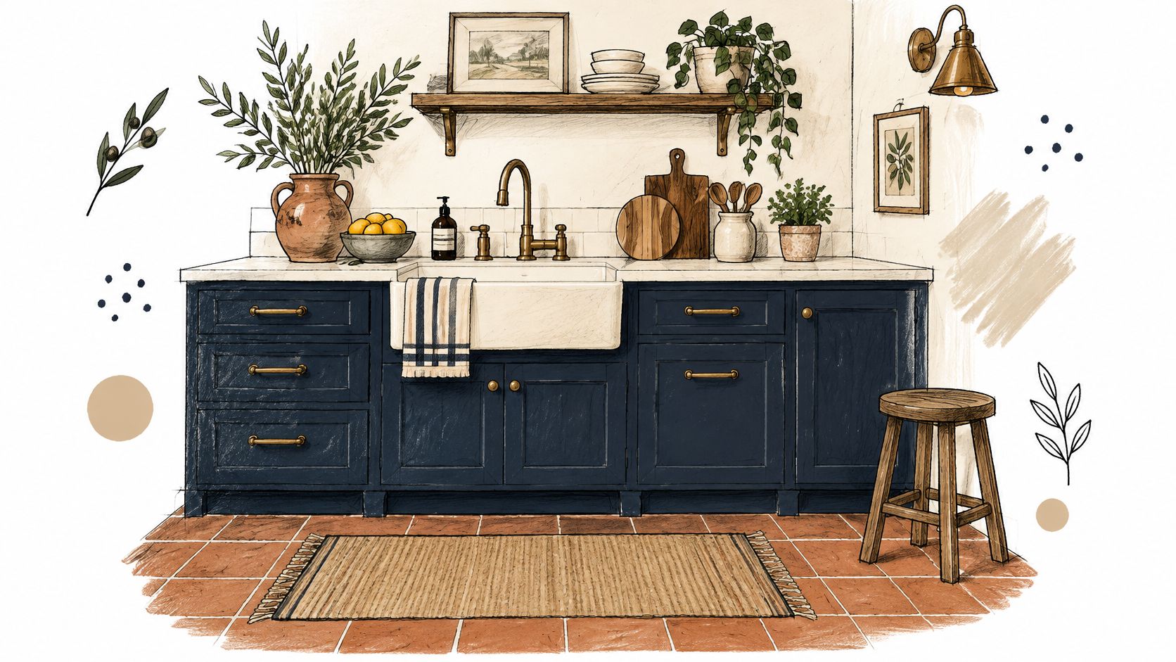
A kitchen with navy lower cabinets, white uppers, and terracotta flooring gets depth without losing light. An entry hall can achieve a smaller version with a navy door opening onto clay tile. Designer Kristen Fiore describes terracotta and blue as a natural pairing, with deeper shades producing a more dramatic effect, in a published guide to colors for terracotta tiles.
Where Navy Works Best
- Lower cabinets and islands: These place navy near the floor, where the contrast is clearest.
- Doors and built-ins: A single painted element gives definition without darkening the whole room.
- Upholstery: A navy sofa or bench cushion works when walls stay cream or warm white.
Cream trim should separate navy from strongly orange tile in low-light rooms. Before ordering, quantities can be checked through the box calculator, with exact coverage confirmed on the product page.
4. Olive and Moss Green
Olive and moss green take a lower-contrast route. Both contain yellow or brown warmth, so they blend with terracotta instead of cooling it sharply. The result feels grounded and natural, particularly in living rooms, bedrooms, and Mediterranean or transitional interiors where the floor already has visible tonal variation.
The risk is muddiness. If the green, floor, wood furniture, and textiles all sit at a similar mid-tone, the room can lose definition. A moss wall needs a lighter break, such as white linen bedding or cream curtains. Olive upholstery benefits from black metal legs, a pale rug, or light cushions to separate it from the floor.
Earth-led palettes have broad expert support. In 2024, 46% of 71 interior-design and home-staging experts surveyed by Fixr identified earthy tones as the most popular color palette, according to PCI Magazine's report on the 2024 paint and color trends. That doesn't mean every olive works. A green that's too yellow can exaggerate orange tile, while one that's too gray can look disconnected.
A Practical Bedroom Example
Moss walls behind a bed, pale bedding, and terracotta flooring create a garden-inspired room without high contrast. The bedding supplies the light value, while the floor supplies warmth at the base. A product such as the Bedrosians Palmetto 6 x 6 terracotta matte tile in Verdant also shows why actual samples matter, because green and clay tones must be judged together rather than from separate screens.
Fabric and paint samples should be compared beside several tiles from the intended batch. Once the palette is settled, the box calculator can be used to plan the room quantity.
5. Honey and Natural Oak Wood
Honey oak and natural oak pair with terracotta through shared warmth. Light to medium wood keeps the floor from becoming the only warm surface, which helps kitchens and living rooms feel layered rather than two-toned. Wood also introduces grain, giving the room texture that flat paint can't provide.
The entryway below shows wood used as a bridge between clay flooring and softer textiles.
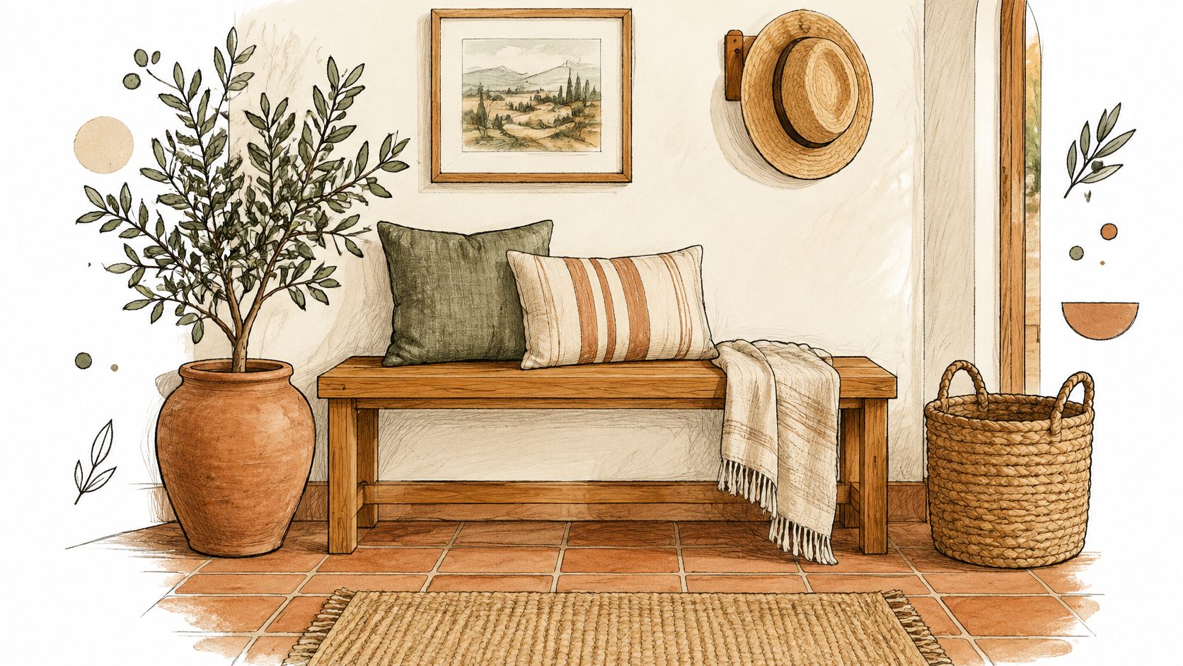
A kitchen with a natural oak island and terracotta floor works when the wood is visibly lighter or darker than the tile. If both land at the same orange-brown value, cabinets can disappear into the floor. Exposed oak beams create a similar issue overhead if the walls are also beige, so warm white paint or a muted green textile should introduce separation.
Warm neutrals remain the stabilizing layer in this kind of scheme. The Fixr interior design color trends report found that 49% of 67 home stagers and interior designers surveyed in 2025 identified warm neutrals as a leading color direction. For an oak and terracotta room, warm white walls perform that role while the wood and clay share the visual warmth.
Checking the Wood Match
A sample of the actual wood finish should be placed on the tile, not held above it under store lighting. Gray-washed oak usually clashes with red-orange clay, while honey finishes with a clear warm cast connect more easily. Readers comparing wood against tile can also review the guide to the cost of new hardwood floors before committing to either material across adjoining rooms.
Tile needs can be estimated with the box calculator, and the product page should be checked for exact coverage per box.
6. Charcoal and Black Metal Accents
Charcoal and black metal give terracotta a sharper, more contemporary edge. Dark lines frame the floor, clarify its pattern, and stop a warm palette from drifting into a rustic theme. This pairing suits kitchens, dining rooms, and entryways where the architecture is simple and the tile is meant to carry most of the color.
Charcoal is usually easier than pure black on large surfaces. A charcoal island or media cabinet has enough softness to sit beside brown-red clay, while true black can look severe if it's repeated on walls, cabinets, and furniture at once. Black works best in smaller, deliberate places that create rhythm across the room.
Repeat black metal at different heights, such as cabinet pulls, a faucet, and a pendant light, so the accent looks planned rather than accidental.
A kitchen with matte black pulls and faucets over terracotta keeps the floor warm but makes the fixtures read modern. A dining room can use a charcoal pendant and black chair frames, provided the walls stay cream or warm white. Without that pale background, charcoal and deep terracotta together can make a north-facing room feel heavy by mid-afternoon.
Placement Priorities
- Hardware and faucets: Small black elements sharpen cabinetry without darkening the room.
- Lighting: A charcoal pendant repeats the accent overhead and balances the floor's visual weight.
- Furniture frames: Slim black legs separate upholstery from similarly warm tile.
Homeowners comparing dark stone effects with painted charcoal accents can read the overview of slate flooring pros and cons for another way to judge dark flooring materials. Tile coverage should be confirmed with the box calculator before ordering.
7. Teal and Turquoise Accents
Teal and muted turquoise bring the clearest blue-green counterpoint to terracotta. They cool the floor, make its red and orange variation easier to see, and suit Mediterranean and coastal rooms where glazed pottery, patterned tile, and painted wood already carry color. Saturation decides whether the pairing feels lively or strained.
A bright turquoise wall beside strongly orange tile creates competing focal points. Muted teal is easier to live with because the gray or green in it softens the complement. It also tolerates natural variation in handmade clay better than a flat, highly saturated blue. Handmade glazed tile brings the same variation to walls, as the guide to zellige tile in a bathroom explains.
A patio room with teal cushions over terracotta can test the palette without repainting. If the combination works, teal can move onto a painted bench, cabinet interior, or patterned kitchen backsplash. The backsplash should remain the main teal surface when the floor is visually active, otherwise pattern and contrast start competing in the same view.
How Much Teal to Use
- Textiles first: Cushions, throws, and rugs reveal whether the blue-green sharpens or calms the tile.
- One fixed feature: A backsplash or painted island is enough once the textile test succeeds.
- Muted over bright: Dusty teal suits brown-red tile, while clearer turquoise needs paler clay and plenty of white around it.
Samples should be checked beside the floor after sunset as well as at midday, since warm lamps can push teal greener and terracotta browner. Larger projects can be planned with the box calculator, followed by a free estimate through the estimate form.
8. Dusty Rose and Blush
Dusty rose and blush harmonize with terracotta because both belong to the warm red family. The pairing has low contrast, so it works best where the goal is softness rather than definition. Bedrooms, dressing areas, and dining rooms can carry it well when the pink is grayed and muted enough to stay behind the floor.
Bright pink is the failure point. A candy or hot pink textile can make orange-red clay look muddy, while a very pale blush wall can disappear beside a pale peach tile and leave the room without structure. The pink needs either enough depth to register as a separate color or enough white and charcoal around it to create edges.
Blush linen bedding over a terracotta bedroom floor gives warmth without repainting the walls. Dusty rose dining chairs can do the same beside clay tile, especially with a natural wood table and cream curtains. In both cases, the pink should be tested on a large fabric piece because small swatches often read lighter than upholstery or bedding will in place.
Keeping the Palette Balanced
- Choose grayed pink: Dusty rose has enough gray to sit calmly beside red-orange clay.
- Add a cool neutral: Warm white or pale warm gray prevents the room from becoming one continuous warm blur.
- Use one dark anchor: A black lamp base or dark wood frame gives the soft palette definition.
This is the most undertone-sensitive pairing in the list, so fabric should be approved beside tiles from several boxes. Product-page coverage should then be checked, and quantities estimated with the box calculator.
How each terracotta pairing compares by contrast, placement, and mood
| Item | Contrast with Clay | Best Placement | Mood |
|---|---|---|---|
| Warm White and Cream Walls | Warm undertones blend with clay; cool whites can look stark | Walls | Open and calm |
| Sage Green Walls | Muted cool green softens warm clay | Walls or cabinetry | Restful and organic |
| Deep Navy Accents | Strong cool-dark contrast makes clay appear brighter | Cabinets, doors, or one feature wall | Bold and classic |
| Olive and Moss Green | Shared earthy warmth creates a cohesive palette | Walls or upholstery | Grounded and natural |
| Honey and Natural Oak Wood | Shared warmth and wood grain add texture | Furniture, cabinetry, or beams | Inviting and lived-in |
| Charcoal and Black Metal Accents | Dark tones frame clay with crisp contrast | Lighting, hardware, window frames, or furniture legs | Modern and industrial |
| Teal and Turquoise Accents | Bright cool contrast lifts warm clay | Pillows, rugs, backsplashes, or art | Lively and coastal |
| Dusty Rose and Blush | Muted warm pink harmonizes with clay | Bedding or upholstered furniture | Soft and romantic |
Plan the Palette Before You Order the Tile
The safest palette has a clear hierarchy. Warm white, cream, or warm beige should usually cover the largest wall area, terracotta should remain the fixed warm element underfoot, and one accent should supply contrast in a controlled place. That accent might be sage on cabinets, navy on a door, teal in a backsplash, or charcoal in lighting and hardware, depending on how much contrast the room needs.
Undertone should be settled before color names are debated. Technical guidance on terracotta tile origins and characteristics explains that clay composition, iron content, firing temperature, kiln atmosphere, tile position, and surface treatment can shift the finished color. Two products both sold as terracotta may therefore need different whites, greens, or blues.
Sealer choice belongs in the same decision. Some finishes deepen clay and make it look richer or darker, while natural-look finishes preserve a lighter matte reading. A paint that suits an unsealed sample may look too pale after sealing, so the test board should include a sealed tile whenever the installed floor will be sealed.
Test in the Room That Will Use It
Lighting can change the right answer after the color itself is chosen. Published terracotta color guidance notes that warm lighting around 2700 to 3000K intensifies terracotta's orange and brown qualities. North-facing rooms usually need warmer off-whites to avoid a cold cast. Bright south-facing or west-facing rooms can handle muted sage, dusty blue, or soft charcoal when the floor needs cooling.
Large paint boards and fabric samples should be placed beside several tiles in morning, afternoon, and evening light. Small chips hide undertone problems, and a single tile can misrepresent the batch. Dry-laying tiles from multiple boxes gives a more honest view of the floor's overall balance before grout, cabinets, or trim are finalized.
Order for the Whole Room
Tile is made in batches and shades drift between batches, so the whole room should be ordered together. Keeping a spare box also helps with future repairs because a later purchase may not match the installed floor. Any coverage-per-box number should be treated as typical until the exact figure is checked on the product page.
To see terracotta tile we list, browse the tile collection, which includes the Bedrosians Palmetto 6 x 6 terracotta range in several colors.
Room measurements in sq ft can be entered into the box calculator to estimate quantities, including the project layout. When cuts, adjoining rooms, or a patterned layout make the quantity uncertain, a free estimate can be requested through the estimate form. Customers can also ask for a sample first when the tile shade matters and view it in their own light before ordering by the box for shipping across the U.S.
Browse terracotta-look and clay-toned tile by the box at Nexora Flooring, compare samples beside the wall, cabinet, and textile colors planned for the room, and use the box calculator or estimate form on the site to order the full quantity once the palette is settled.